You can apply animated transitions and loops to components in your app for a more visually dynamic presentation of your data.
There are three types of animations available in Connect.
Transition
Transitions animate a component or widget in and out of your app.
Loop
Loops animate a component or widget continuously in your app while it is being shown.
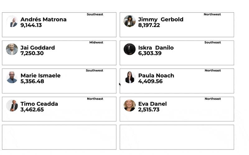
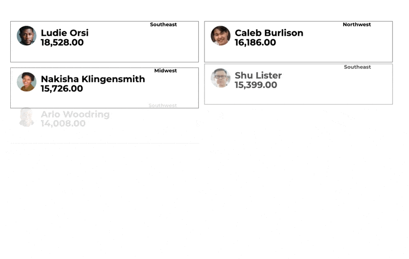
Cycle
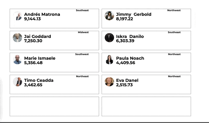
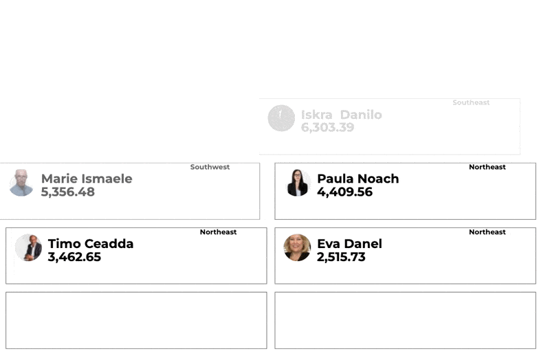
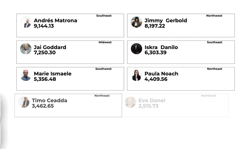
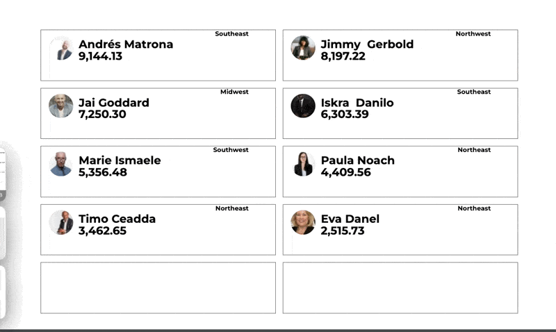
Cycle animations cycle through your data record in a repeating grid or slide widget.
Animation Settings
Duration
Set the amount of time your component animates by clicking on the number next to Duration. You can either enter in a new numeric value or use the arrows to the left to increase or decrease the duration.
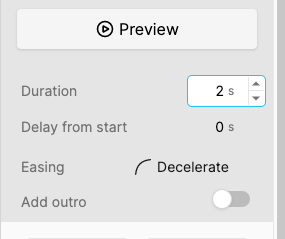
Delay from Start
Set the amount of time before your component animates by clicking on the number next to Delay from start. You can either enter in a new numeric value or use the arrows to the left to increase or decrease the delay.
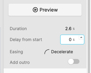
Easing
Adjust the overall speed, acceleration or deceleration of the component animation by clicking on the easing drop down and selecting an easing option.
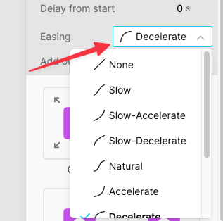
Easing selections available: None, Slow, Slow-Accelerate, Slow-Decelerate, Natural, Accelerate, Decelerate, Quick, Quick-Accelerate, Quick-Decelerate
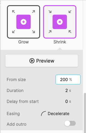
From Size
Depending on the animation selected there may be an option to set the size of the component at the beginning of the animation. Choosing the percentage number next to from size you can either enter in a new numeric value or use the arrows to the left to increase or decrease size.
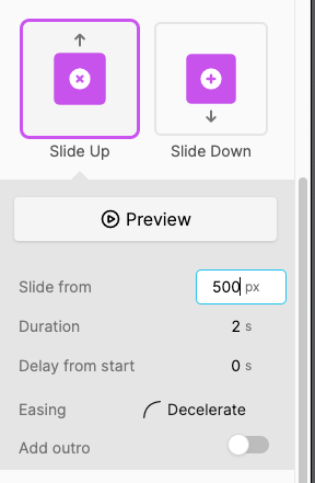
Slide From
Depending on the animation selected there may be an option to set the location in the app of the component at the beginning of the animation. Choosing the location number next to slide from you can either enter in a new numeric value or use the arrows to adjust.
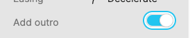
Add Outro
Transition animations have settings to animate out in the same fashion as the transition in animation. Click the add outro toggle to enable an outro. This will not loop once the outro is completed the component will remain at the original location size or opacity at the start of the animation.
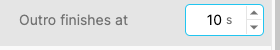
Adjust the time your component remains on the screen by changing the Outro finishes at value. This value will include both the intro and outro animations.
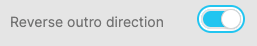
By default slide transitions intro and outro in the same direction. Click the toggle to change the direction of the outro. For example if a slide down transition is selected then the outro will slide up.
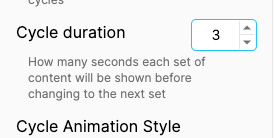
Cycle Duration
Set the time in seconds each set of content will be shown before changing to the next set in a repeating grid or slide.
Transition Animations
Fade

Grow

Shrink

Slide Up

Slide Down

Slide Left

Slide Right

Loop Animations
Blink

Pulse

Cycle Animations
Fade
Slide Up

Slide Down
Slide Left
Slide Right
Flip
Shrink/Grow